AppLED

2014

User Interface and visual identity for a light remote control mobile app

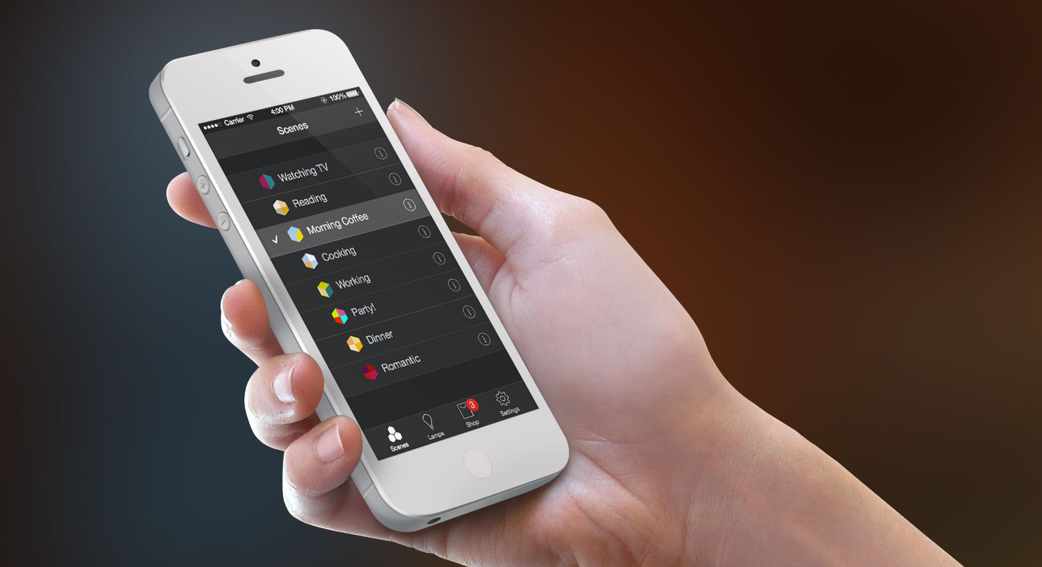
AppLED is an app that allows you to control wirelessly LED lamps. The system is working with a wide range of LED lamp models. It runs on iPhone, iPad and any iOS7 device. I was in charge to define a visual identity for the product, from the app icon to the user interfaces.

The color-pickers are in an hexagon shape. It defines the app identity, and it is also a convenient shape to select colors easily with the thumb.

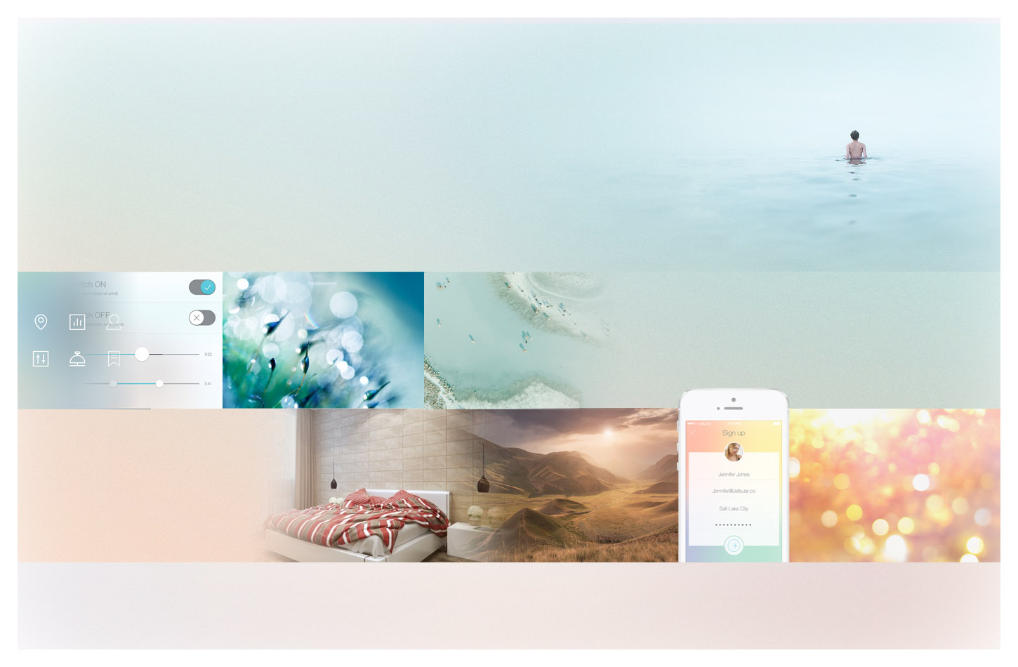
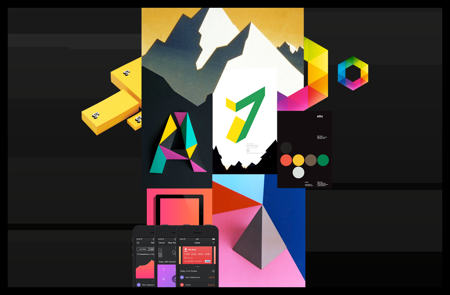
I produced moodboards to set the possible creative directions. Moodboards are visual compositions of selected images, carefully chosen and assembled to reflect or express the aspects of the product and its qualities.

This moodboard shows lights treated as soft sunrises and warm sunsets. The product is the promise of a never-ending daylight. Colors are glowing, like a peaceful sensation spreading from the LEDs. Watercolour and pastel tones release a sensation of simplicity. Colors are floating, light is flowing, as using the product is natural and fluid.
The moodboard chosen by the client has bright colors, evokes the playful customization of colors, fun and happiness. Shadows are visually represented as geometric flat surfaces, creating new colorful shapes. Shadows are considered equally as part of the visual environment. Black backgrounds makes colors pops up even brighter. Clear edges, dynamic lines and sharp angles refers to the high efficiency of the product, the latest technologies it uses.
This is the chosen moodboard. It has bright colors, evokes the playful customization of colors, fun and happiness. Shadows are visually represented as geometric flat surfaces, creating new colorful shapes. Black backgrounds makes colors pops up even brighter. Clear edges, dynamic lines and sharp angles refers to the high efficiency of the product, the latest technologies it uses.

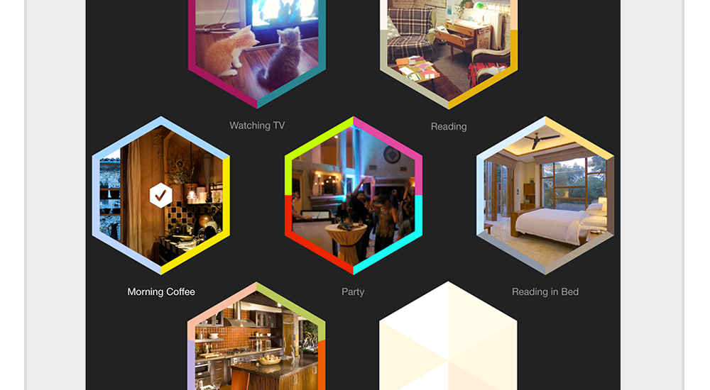
From the creative direction ensues the main elements of the visual identity. The hexagon becomes one of the main symbol of the app. With sharp edges creating oblique lines, it creates a dynamic impression, expressing efficiency and technology. Polygons with six sides reminds also the bees honey combs, a strong modular home structure.

appled-icon-pres
The App Icon is a light bulb full of colors. It represents the main function of the app: controlling the colors of light. The base of the bulb can be seen as a wireless connection symbol.

The dark backgrounds makes colors poping out. It evokes also the night time, when the app is mostly used. Colors displayed in the app are almost always related to the lamps, emphasizing on the main purpose of the product.

The user can save a preset of colors under a Scene. He can take a picture to remember what the scene looks like. I provided solutions to keep the UI elegant and coherent regardless of the quality of the pictures.

The border around the pics, displaying colors of the lamps included in the scene. If the screen is too small to display pictures, of if none were taken, the default icon is using the lamps colors as well.

AppLED is available on iTunes for iPhone and iPad.