When you think about your household’s income, do you feel rich, poor, or just average? Most of us have no idea – or the wrong idea – of how we compare with the rest of the population. In a few clicks, you can find out how many households are better or worse off than yours, and see how your ideal world compares.
Compare your income introduction, OECD
We have tried to make this tool fun, didactic and easy to understand by users from a wide variety of backgrounds. We have structured information to make it readable, chosen a simple and coherent aesthetic, illustrated and animated the statistical data.
You can experience the tool right below or open it in a new tab.
My Role
We worked in tandem with the developer Anthony Veyssière. I worked on the user experience and artistic direction of the interface, illustrations and animations.
Intentions
The OECD’s objective with this tool was to reach a very wide audience. It had to be designed to be translated into several languages, and was therefore going to be used by users from very different cultural backgrounds. It had to be engaging and rather playful, and able to communicate a sometimes complex statistical information. The tool was intended to be a questionnaire that allowed the user to fill in information about her or his income, his or her wealth estimate in relation to the rest of the population, his or her perception of wealth distribution and the ideal distribution of wealth according to her or him. Once this information was filled in, the tool would then display it together with the actual statistical data.
Building the Structure
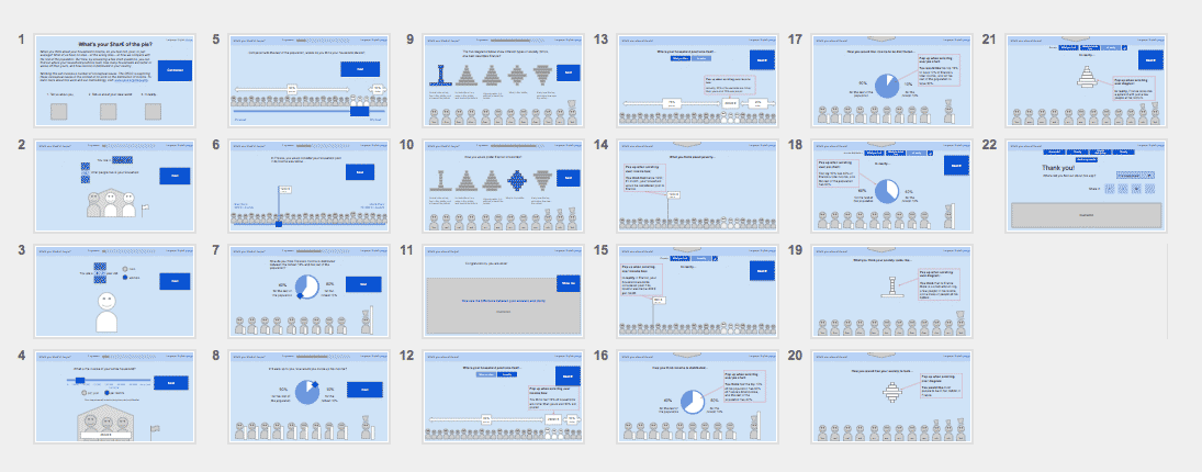
The first step was to define a global structure. Based on the draft provided by the OECD, we produced non-graphical and non-interactive wireframes. This helped us to take fundamental decisions on the organization of the content and to ensure consistency between the different screens. It provided a foundation for the OECD to write editorial content, for Anthony to develop the tool, and for me to design the interface. Using Google Slides allowed us to collaborate remotely.
Creative Direction
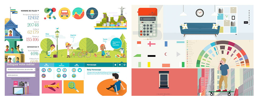
To find an aesthetic orientation, I designed two moodboards. These boards are a composition of graphical elements found during my research or from links provided by the OECD. They contain images from interactive or non-interactive data visualization, illustrations or screenshots. As the audience of the tool was going to be very diverse, it was necessary to have an easy-to-understand aesthetic. I chose clear, simple and very legible visuals. The colours are flat, the shapes are geometric, and the plain illustrations are almost like pictograms.
The moodboard with the most cheerful colours and illustrations was chosen to define the visual identity of the tool.
The graphic mock-up of the first screen is based on the wireframes and on the artistic direction defined by the moodboard. The purpose of this screen is to introduce the tool to the user and explain the main steps.

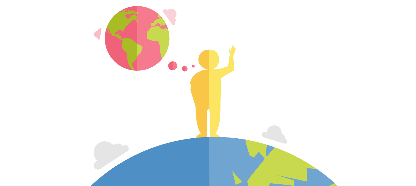
For greater clarity and consistency, the illustration chosen for the home screen is composed of two universal elements: a schematic planet and a human. The planet is declined as a balloon to evoke the ideal world, in opposition to the real planet on which the character stands.
Colours, illustrations and animations
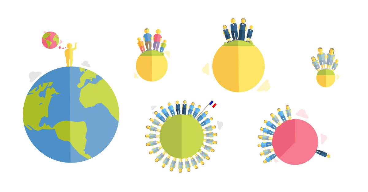
In order to make the tool user-friendly, I tried to keep a visual and conceptual continuity between the different screens. Turquoise is used for the interactive elements of the interface, pink to evoke the ideal state, blue to represent reality, and yellow for the user or wealth.
Illustration forms and concepts are reproduced and adapted through the screens: a small planet becomes a home, inhabited by characters with identifying attributes: men, women, children, poor or rich. The planet is also turned into a circular diagram to represent the distribution of wealth.
Data Visualization
Illustrations are animated dynamically to instantly visualize the data selected by the user or reported by the tool. This makes interaction more fun and data easier to understand.
Danish Version
Few weeks after the launch of the OECD tool, we were contacted the Danish Statistical Institute. they asked us to design and adapt the OECD tool their needs, in order to communicate their national data to the Danish population.
You can experience the tool here: dst.dk/da/Statistik/Publikationer/indkomst.
To match their needs, we ahad to design, code, structure, colours and illustrations.
Broadcasting
In addition to the Danish version, the OECD tool is now translated into nine languages and has been distributed on news websites worldwide such as El Pais, Le Figaro and CNN Mexico.